We designed our intranet to be continuously improved, and over recent weeks have been doing just that. Since the intranet’s launch last year we have gathered data and done extensive research to deepen our insights into our users’ behaviour. This is enabling us to flex our product to meet our users’ changing needs - in line with digital best practice.
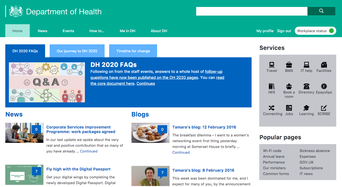
In our most recent development sprint, we focussed on the homepage. The intranet homepage is the first thing most people in the department see when they log on in the morning, so it’s not surprising that 99.9% of user journeys begin there. That’s not true of all websites - GOV.UK pages are often reached via a search engine - but our default makes the homepage a prime piece of digital real estate. It deserves excellent design and only the most important content or features.
From looking at site traffic we could see the content users visited most over the past year. For instance: guidance on performance management, expenses claims, booking video conferencing, and a few specific forms. Over the last month or so, content about the DH2020 change programme has also been very popular.
This data informed our qualitative research. We interviewed twenty-one individuals, asking them about their use of the intranet. We also observed them using the homepage to try and perform particular tasks. As well as interviews, we ran card sorting exercises and a co-design workshop where users drew sketches of their ideal homepages, or voted on features they liked from other government intranets. The range of ideas generated ranged from the pragmatic to the extravagant. But the discussion was invaluable in helping our suppliers understand the needs of DH staff. Over two weeks our experts translated those insights into some of the changes you can now see:
- Bringing in common design patterns by integrating the menu, search and login into the header to help users find them
- Developing prominent areas for links to popular services and pages; these are customisable by our content team so can change as needs change
- Introducing a campaign box to highlight the most important ‘need-to-know’ information of the moment
- Increasing the number of news stories further down the page; as the large number of users felt the stories dropped off the homepage too quickly
- Retaining a clean design that users responded to well, but binning the bits that users did not need or want anymore
Communicating via Slack across several UK locations, the team deployed the changes early last Tuesday morning. Thanks to the brilliant work of the developers we encountered almost no bugs, and by the time we got into the office some fantastic feedback had started to come in.
Launching is the start of a process, not the end. We’re moving straight into more user testing, including those using assistive technologies, to ensure our changes are performing as we want.
An ‘agile intranet’ is something the department should be proud of. Internal services and tools are rarely built in this way. It has only been possible for us to effect improvements to this product quickly, cheaply, and securely thanks to our predecessors. They left us a site built on open source software, to open standards, with no contract lock-in, and with the precedent set for relentless focus on user needs. Long may that continue.
4 comments
Comment by Shane Dillon posted on
Chris/Sian, great blog post. Good to see intranets become a talking point. Two questions; does your new intranet use Buddypress to add social features like a newsfeed for staff to join the conversation? Also with the growth of WordPress based intranets (MOJ use WordPress?) does this convergence make it easier for the emergence of (a) one HMG Intranet or (b) allowing two govt departments whose work overlaps to share or link to another Whitehall intranet.
Also being nosey; what is Scribe? and is this workplace status an intranet social feature? or simply a logging into the intranet to get a more personalised experience. @shane_dillon
Comment by Chris Fleming posted on
Hi Shane, thanks for commenting. 1) No we don't use buddypress, Yammer is DH's main social tool. Commenting is enabaled on pages and posts on the intranet site itself. 2) You make a thought-provoking point about one government intranet. It makes a lot of sense although would require quite a lot of political will and effort at the centre to get done. Not sure how big a priority it is with everything else going on. I am sure the conversation has been had somewhere though I'll do some digging. 3) SCRIBE is a system we use to manage correspondence and parliamentary questions.
Comment by Travis posted on
Hi
It looks like you've done a good job.
I'd like to query one design choice though. Why did you use icons in the 'Services' box? They add to the clutter and only two or three of them intuitively represent what the word underneath them states.
Icons are only helpful if they are universally understood. Otherwise they just increase the interaction cost and add noise.
I refer you this - https://www.nngroup.com/articles/icon-usability/
I look forward to hearing your thoughts.
Thanks and well done on the revamp!
Travis
Comment by Chris Fleming posted on
Hi Travis, thanks for commenting. You make an excellent point and this is something we continue to consider carefully. We wanted a way of making key services really visual and prominent on the page, in order to meet a number of well evidenced needs around users finding things. Based on the knowledge we have of our user base, icons+text felt the best way to do that. We've also reduced quite a lot of the clutter in other ways so hopefully on balance it remains a clean experience. It is testing very well in our subsequent research but obviously if we find evidence that this is making for poor UX will change things and continue to monitor to ensure it is meeting needs. If you are aware of other stylings we may wish to consider here let me know.