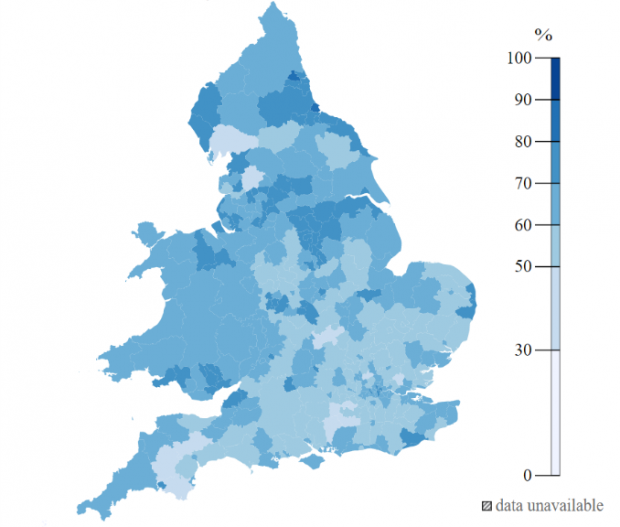
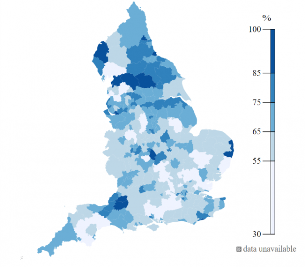
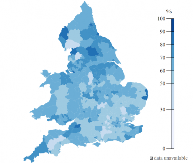
In our work to improve the uptake of Healthy Start vouchers for lower-income families, we have developed a map of Healthy Start uptake. This blog post introduces the map, explains how and why we created it and what we'll be doing next.

How we came to develop the map
Local authorities play a big role in public health and more specifically in helping to raise awareness of the Healthy Start scheme. At a recent Healthy Start event organised by London City Hall, one of my colleagues heard that a local authority was having trouble getting access to data on the performance of the scheme locally and wanted to measure the uptake. (Uptake is defined by beneficiaries enrolled on the scheme/eligible beneficiaries).
The process for local authority staff to get access to data was not ideal and required emailing people and sending spreadsheets. Some knew the right person to email, others didn’t.
The local authority mentioned that, as well as making it easier to see the uptake in their area, having this information could help them to:
- benchmark their success against others/nationally - for example, if uptake was low in their area it could compel them and their managers to put more resource into the scheme (especially trying to raise awareness of it)
- check how well they were doing among their peers - for example, to see how well they were doing compared to neighbouring local authorities
- see a picture nationally so they could spot local authorities with high uptake and try to speak to them so they could learn best practices.
After discussing some different ways to open up access to the the data, we decided we would start small and create something visual where users could easily identify uptake in their area.
Making the map
We decided to make a choropleth (my new favorite word) or thematic map. It my first attempt at making this kind of visualisation, and after a few web searches I found some good examples and started to make some progress on a proof of concept to share with the team.
By happy coincidence, Matt, the technical lead working on Healthy Start beta, had some experience of working on choropleths with the Office for National Statistics (ONS). After a crash course from Matt in using the ONS’s tool, I was able to create an initial map using the data we had on England’s local authorities.

We limited it to England on our first iteration, this was because we had good quality uptake data for England, which meant we could create something quickly in order to test if this kind of resource was valuable to our users.
With agreement to host the data on the team's github, we sent out the details of the first map to our stakeholders. The feedback was positive, but as expected we had more work to do.
Do you have Wales data available in this format at all? (NHS colleague in Wales)
As a team we believe in incremental improvements and, true to our word, we got feedback and took action. We expanded the coverage of the map by adding Wales. In order to use the ONS’s mapping tool we needed to match 418 local council names to their respective code. In order for the matching tool to work, the council name we put in needs to be an exact match to one on our reference list.
When we first tried to match the data for Wales we didn’t get matches on all the local councils we provided. Without the local council code, the ONS tool doesn’t work so I needed to find a fix. When I checked the data, the council names provided didn’t match our list of local councils. This meant we couldn’t match the councils to their code.
Next, I made sure with the data provider that the council names we had could be matched to the data. Potentially worse than having limited access to data would be providing entirely misleading statistics. Thankfully, after getting the confirmation I needed, I was able to amend the names and successfully match them to their respective codes. This meant I was able to add the Welsh local councils to our map.

How the map is being used
While we set out to provide local councils with better data of Healthy Start in their area, we have also found it a helpful tool internally for things like planning user engagement. We have also heard from others outside of the department who are using it to track down local authorities with the highest uptake so that they can find out more about their approaches.
The map has also encouraged a PhD student to get in touch to get hold of more data. They have agreed to feed back their research to the team, and we wouldn’t have known about this if we hadn’t shared the map.
Next steps
Our next step is to work with our supplier to get the data in the right format as we also need to show uptake in Northern Ireland. We’ve also updated the map with the most up-to date data each month so that it remains relevant to our local authority colleagues.
Further into the future, we would like to make the data as open as we can, especially as we have an opportunity since we are redeveloping the current service. We know this is just a small step forward.
If you have any feedback or suggestions then contact nhsbsa.healthyfoodbeta@nhs.net. We’d love to hear from you!