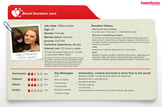
Meet Chris, Pam and Dan – how user personas and user cards can inform a relaunch.
Last week, the NHS Blood and Transplant (NHSBT) blood donor website offering self service functionality for appointment booking and managing donor information passed the Government Digital Service (GDS) digital by default service assessment. Mamta Ruparelia, Head of Digital at NHS Blood and Transplant, talks about how user personas and user cards informed the relaunch of this service.
In November 2013 we launched a refreshed version of blood.co.uk with self service functionality. The cornerstone of this relaunch was a new and vastly improved user experience that allows blood donors to manage their bookings online. Working alongside specialist agencies, this update gave us a useful opportunity to question our typical assumptions about our users and how our content might be better tailored for them.
Donor insights tell us that our typical blood donor is a 42-year-old woman (let’s call her Rachel) from Gloucestershire who phones to make her appointments. We are often at odds around the campaign table over whether to target Rachel when looking for new donors, or whether to aim for the difficult-to-reach 17 to 24-year-olds for whom so many years of potential donation await.
Of course, the answer lies not so much in the profiles of existing donors, but in the profiles of those typically using our site. We have always understood our donors pretty well. Our staff meet them, chat with them, take blood from them on a regular basis. But to get to know our site users we worked with our agencies on some research to provide us with user personas. No offence to Rachel, but she is no longer from Gloucestershire, she is called Pam and she has been on a computer literacy course.

Persona development
The focus of the persona development was to remember that they needed to be high level enough to cover the main characteristics of the target group:
- wants
- needs
- influencers
- engagement points
But also to ensure that they resonated enough with real scenarios, so they are believable and not paying just lip service, wrapped up in a nice design. The best personas are based on real people and while they end up seeming relatively generic they encompass patterns from real. To be of use they are always based on research.
With the blood personas the trick was to pull out common themes. Speaking to real people wasn’t a problem. Often people fall into the trap of worrying they can’t find the right person to accurately represent an audience demographic – that can be true if it is a very specific requirement, but it’s often better to start easy, speak to family, friends and colleagues that fit the profile. Try not to be directive in your questioning but ask about real experiences. Speaking to 5 – 10 people from each group will be good enough to get the most common themes. These can be refined and tested to make sure they are representative.
Remember, always speak to the people who come into contact with your target audience day in day out – in this case NHS staff. They will have good insight that you can use to test your results and to identify gaps or suggest areas for deeper study.
Always remember to revisit personas regularly, whilst motivations might not change the world around us does, so influencing factors and specifically technology will need to be adjusted to reflect the impact this has on actions and behaviours.
User personas
The 3 user personas gave us more than a ‘who’. They gave us ‘what they visit’, ‘why and how often they visit’, and we learned the kinds of issues they face and what kind of people they are.
I am paraphrasing here, but please meet Chris, Pam and Dan:
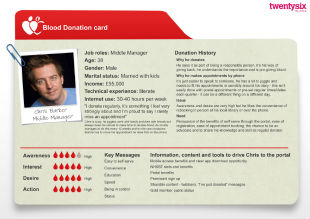
Chris is 38, a middle manager earning £55,000. Chris is busy, he juggles time with work, family and friends. He donates blood regularly and usually makes appointments on the phone.

Pam is 42, an office worker earning £40,000. Pam is also busy, she’s a city worker who gives blood intermittently, with frequent lapses. Other things just take priority, she would welcome a better organisation of her appointment times.
Dan is 19, he’s a student. Dan doesn’t donate. It’s not that he’s too busy he just isn’t aware of the need for blood. He is always on the internet.
Our 3 personas were our guides as we developed blood.co.uk. Who needs help with organisation? Who will be quick to take up new technology? Who still needs persuading? The aim of personas is not to represent ALL audiences but to enable us to focus on the key requirements of our most important user groups.
We realised that existing and potential donors need to be armed with the information that really matters for busy people. Why do people get turned away from donating? Does Dan’s tattoo mean he cannot donate? Much of this information was contained on the old site, but we made it forefront in the new design.
User cards
However, if we waved goodbye to Chris, Pam and Dan at this point and closed our analysis, we might be missing something. User personas may cover web usage but they are not so useful for user goals. Informing us that Chris likes ‘being responsible’ is not particularly insightful for our site architecture – it doesn’t tell us what he came on our site to do.
A user card is a simple way of describing user tasks and goals. You form a card from completing three key statements:
As a… [insert type of user]
I want to…[insert what they are trying to do]
So that I can…[insert user’s final goal]
If we take the Digital Health channel’s user group as an example:
As a Digital Officer
I want to read blogs on user personas
So that I can learn more about user behaviour.
There is a really good guide to the value of user cards on the GOV.UK website. Producing multiple user cards for your user group gives a really clear focus for the development of your site. If your users can reach their goals, then your site is a large part of the way to being successful.
An improved user experience
This user analysis showed that the site needed to give donors the chance to take control. The website has been upgraded to allow real-time bookings and maintain a detailed history of donations. Pam should be happy that she can now schedule her diary and her donations online. Results show that the real-time session slots and the ability to change appointments online have been a huge success. We achieved our annual target of registrations within 12 weeks (currently over 430K users) and these donors are better at keeping to appointments. Their attendance rate is 3% higher than appointments booked through other means and instead of just not turning up if they cannot make a session, they cancel ahead of time online, making that slot available to other users.
(By the way, Dan can donate with a tattoo, he just has to wait 4 months after getting it!)
Like this post? Sign up to email updates for the latest Digital Health blog posts.