In the Department of Health’s (DH) Digital Strategy published a year ago, we pledged to adopt a digital first approach to all communications activity and evaluation (among other things!). And since then, the question of how we improve the way we measure the performance of our communications (both at a channel, team and department level) and how we report and share that information has been at the forefront of our minds.
The need for regular, reliable and non-labour intensive performance reporting has also been made even more pertinent by the recent cross-government Digital Communications Capability Review and the soon to be published DH Communications Capability Review.
As a team we are tackling this commitment, and indeed this question, in a number of different ways. But, I’d like to share a bit about a project I’ve been working on to build a performance reporting dashboard, our process of commissioning and building the alpha version of the tool and what we learnt along the way.
We don’t have a big team to manage our product developments so on this project, Susy Wootton has been fulfilling the product manager role, Hong Nguyen has been acting as the informed user/tester and I’ve been performing the delivery manager role.
The brief in a nutshell
What did we want?
We wanted to create a reporting tool that:
- gathers information on the activity of digital communications channels
- performs basic analytics to bring meaning and context to the information
- presents it in an intuitive way to help communications and policy staff learn about and improve the impact of their efforts to reach and engage target audiences
Why did we want it?
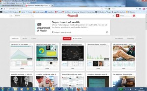
- To free up our Digital engagement team – We already provide statistics and insight to staff, the wider health and care system and the public using a variety of different channels and methods eg. our DH Pinterest site below, but these are all produced manually by our Digital engagement team.

- To become a more effective team – to easily monitor our own performance and improve it, including on the fly during an event or campaign and not just afterwards
- To lead by example – to show that we measure our own performance in an open, transparent, useful and understandable way
- To become a ‘digital first’ department – to make the form and extent of DH’s performance reporting more digital, so as to:
- instill a mindset of transparency, accountability, rapidity, replicability and measurability
- embed a process around evidence-based reporting, incorporating preset and quantifiable KPIs, measurement against baselines, achievements and outcomes
- develop and use fit-for-purpose tools to demonstrate this new way of working, both for internal processes and public consumption
What will the tool do?
Report information on the public’s engagement with:
- each of the ministerial priorities: vulnerable older people, mortality, compassionate care, dementia and technology
- selected areas of interest: the Francis report, Morecambe Bay Investigation and other time-bound events
We decided to focus the alpha project on one of our priorities, Dementia and use the resulting minimum viable product (MVP) as a proof of concept during the G8 Dementia Summit on 11th December 2013.
Where will the data come from?
- Campaign sites - Google Analytics
- GOV.UK - Google Analytics
- Social media - Topsy Pro and other tools
- Email marketing – GovDelivery
The solution must haves:
- adhere to GDS Service Design Manual
- be easily shareable - via email, Twitter, Facebook, Yammer
- use data visualisation as default - where possible
- be printable - for use in paper-based meetings
- be scaleable (alpha and beta) – our vision is to include wider range of metrics eg. press and visit activity from within DH, similar measurable activity from selected ALBs and broader public benchmarks
- be flexible (beta) – we must be able to change which priorities/areas we report on as policy objectives shift – and ensure the way we visualise those goals remains meaningful
The Alpha project
We took a fast prototyping approach to the alpha project, milestones included:
- 1 day workshop on 31st October where we:
- Defined all user stories
- Defined all the data sources/APIs
- Defined the graphs/visualisations
- Designed wireframes
- Discussed technical requirements e.g. browsers, data storage, caching etc
- 4 week development sprint starting on 1st November
- UAT on 4th December
- Delivery on 10th December
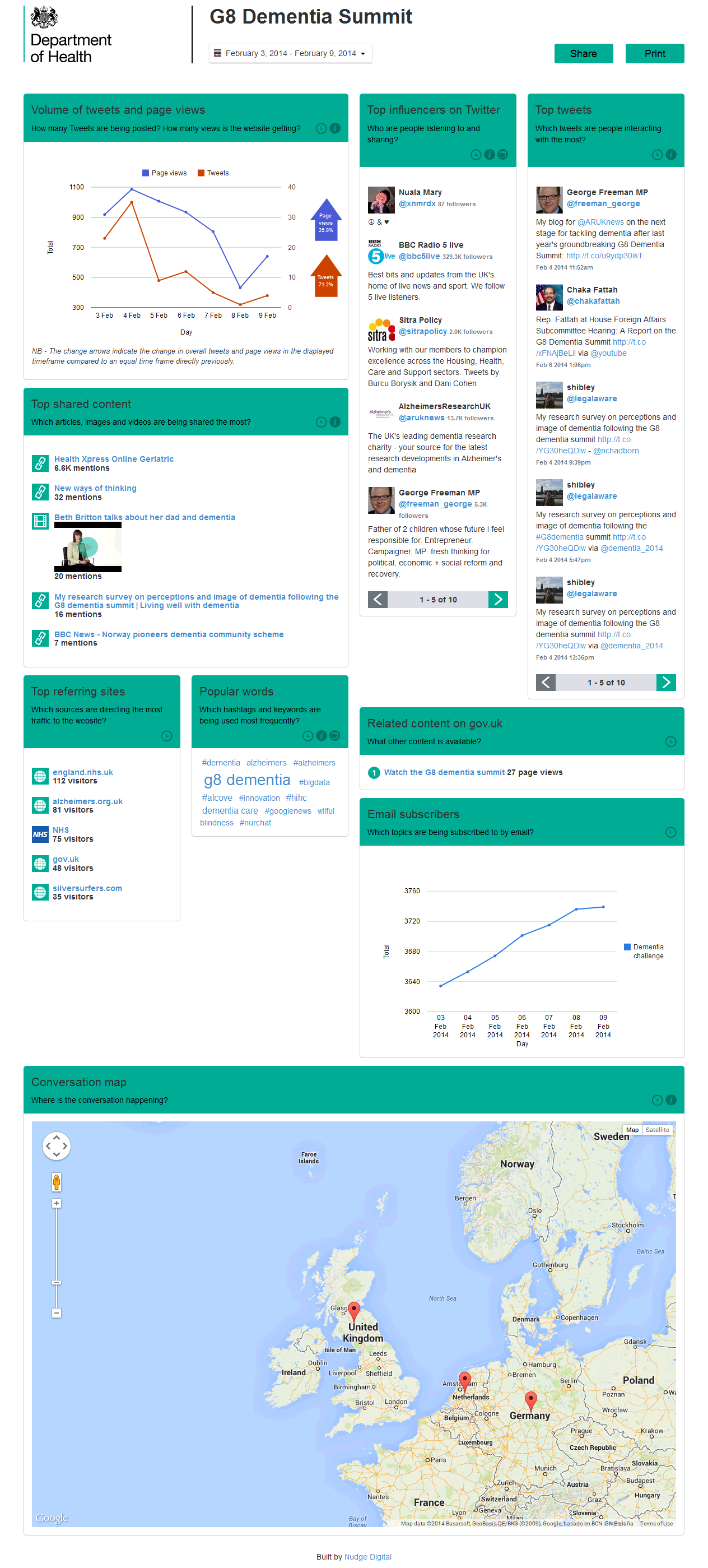
The Dashboard
Here is a screenshot of the finished Alpha dashboard. Click on the image to view a larger version.
Project challenges
We had a few set-backs during the project, the most serious and unexpected being Apple buying Topsy Labs on 1st December, our original go live date. Needless to say I didn’t have that on my project risk register! Our access to the Topsy API was temporarily cut-off following the announcement and we were left with a dashboard which displayed hardly any data. Our access was eventually restored and the lovely staff at Topsy Labs were kind enough to let us have unlimited data for the day of the G8 Summit and for an agreed period afterwards.
In fact, most of the challenges on our project were related to APIs and our lessons learned below, mean we may have to approach our beta project in a different way.
- Most API’s have data limits – we’ve tried to use intelligent querying and caching of data where possible to get the most up-to-date data whilst avoiding hitting API limits but this has proved difficult
- Some API’s were just not as advanced as we hoped
- Some Companies charge to use their API’s or have a pricing structure based on the amount of data you use
Next Steps
- We tested our dashboard on the Dementia summit - 11th December 2013
- Post-summit wash-up on how the proof of concept and project went – mid January 2014
- Kick-off Beta project – mid February 2014. Some of our ideas for future iterations:
- Create multiple customisable dashboards
- Include additional data sources
- Display WordPress comments
- Export/email data in PDF, CSV, RSS
- Set automated reports to Social media
- Dynamic infographics
- Polling
- Integration with Google Trends – 3rd party content matching keywords
- Email alerts for spikes
I’ll keep you posted on how we get on in further phases of this project and Susy will be blogging soon on how we used the dashboard and how we intend to use further dashboards.