As a digital team, the tools available to us for communicating our messages are ever expanding and we sometimes need to take a step back and think about what is the most useful approach, rather than the most innovative.
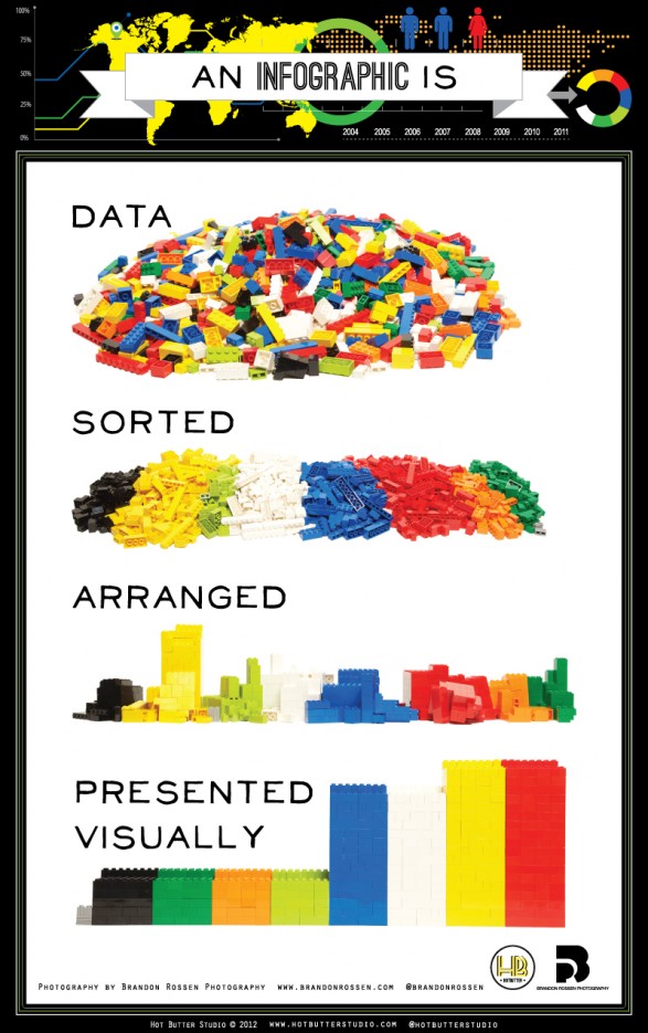
One of the more recent tools at our disposal is the infographic. But what are infographics exactly? Well, they are actually an excellent way to provide a quick and clear visual representation of data or complex information. Take a look at this infographic explaining what an infographic is!

What we’ve learnt so far
Here are a few of the key lessons we have learnt so far, which shows that really most of the same rules apply for infographics as they do for planning and commissioning other communications products.
- Start by clarifying your objectives. What story are you trying to tell? Is there a call to action?
- Don’t assume that an infographic is the right tool for the job. Never decide your tactics until you are sure of your objectives.
- No number of pretty pictures will help explain a policy if your policy isn’t actually clear. Whatever communication method you use, your message needs to be clearly defined from the outset.
- Make sure your data is correct. Check your stats thoroughly before you start. Or you’ll just have to start again from scratch.
- Make sure you leave enough time. Just because the final product looks simple doesn’t mean they’re always quick and easy to produce.
- Proofread your text thoroughly. The supporting text needs to be just as clear and easy to understand as the images.
- Test it on people first to ensure it makes sense out of context.
- Think about how are you going to promote your infographic once it’s created. Make sure it is easy to share, whether embedded, as a jpeg, or slideshare, through flickr or vimeo.
More examples we like
The Guardian also regularly produces a variety of infographics. This one shows Government spending in 2010-11.
And another good example is the four-page stroke infographic produced by the Wellcome Trust. In a related post, their Information Designer Paulo Estriga talks about how he developed the infographic.
Also take a look at the Information is Beautiful Awards website for more examples.
2 comments
Comment by Sarah Amani posted on
Excellent! I have been waiting to see smarter use of big data in the NHS and your team has initiated this journey with the right proportion of enthusiasm and caution. Well done!
Comment by Hannah Bridges posted on
Thanks for sharing Alice. Really helpful!