One of the big misconceptions about ‘digital’ is that it’s all about clever technical people doing things on very fast computers.
If you type digital into google images, you see images that look just like The Matrix but in a different set of colours. It’s a bit terrifying for someone who grew up in the UK before computing became just as important as PE in schools.
But from my experience so far in the digital team, while the technical people are very good with computers, they also spend a lot of time with real people and sticky notes.
In this second sprint of the intranet development project, we’ve been doing lots of user research; testing how people currently interact with the intranet and finding out the things that they would change. This is a sticky-heavy activity. We and our developers sit together, watching what users are doing, and noting down our observations. We arrange them into big themes and this informs the changes we choose to make and test on the site.
One recurring theme that comes up in conversation is the navigation on our intranet. We’ve currently got 3 content areas - ‘How to…’, ‘About DH’, and ‘Me in DH’. But from those titles it’s not obvious where you’d go to find a purchase order template, book a meeting room, or see what’s for lunch tomorrow - all of which are top user needs, according to our search analytics.
We decided to ask some users of our intranet how they would structure the ‘Information Architecture’ of the site, given that we’ve got lots of important and useful content, but sometimes it’s just a bit hard to find. If we build the structure around the way that users naturally think about things, rather than an artificial structure that we impose on their thinking, in theory they’ll save time finding the information.
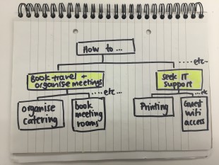
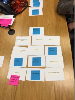
To do this, we took the section titles from the ‘middle layer’ of our information hierarchy, the level below the 3 main categories, and stuck them onto index cards. These are section titles such as ‘book travel and organise meetings’ and ‘seek IT support’, a level above individual page titles such as ‘book meeting rooms’ and ‘guest wifi access’.
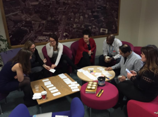
We asked 2 groups of volunteers- one group in our Leeds office, and one group in our Waterloo office- to look at the 35 section title cards when they had been shuffled, and to re-organise them in a way that made sense. We armed them with stickies too, so they could suggest new content, discuss new titles, break cards down, clarify language, and create new groups of cards under meaningful headings. Our internal comms colleagues helped to facilitate the workshops, and we also invited the senior stakeholders in the project to come and observe, so that they could see the users of their product in action.
The reassuring thing is that the ‘old’ and ‘new’ categories came out broadly the same as they were when we carried out this activity as part of the original intranet development work. However the different teams have suggested different ways of labelling things, which we've gone on to investigate further. We ran a further session with a closed card sort using some different labels, which helped us to understand even better how users think about information they need at work. This session surfaced a lot of very insightful feedback about the intranet in general. It reinforced our findings from the previous session, which gives us even more evidence to support making those changes.
It’s essential to have real user evidence as the basis for making decisions about how we make changes to the intranet. It means that we know what to prioritise so that the changes we make will really reflect what users need.
Next up, we’ll also be doing some work on the content and layout of the homepage, co-designing with our users, shuffling more index cards, and inevitably making the most of lots more stickies.
We'll keep you post(it)ed.


2 comments
Comment by Tom Gannon posted on
Really like this piece. We love a sticky too!!
Comment by Charles Allen posted on
7 Key Questions when designing websites: Who, What, Why, When, Where, How, How Much? Who. Who's website is this, is it the one I want for the information I need. Make this clear and that is part of the task completed. What. What does it take to find the information I require (Search, navigation etc). When. When was this website last updated and is the information current? How. Do I receive the information, analogue, digital, instant delayed? How much? Will this action cost me, both time and financial. Use these ideas to help when designing websites. Good luck and Happy Christmas.